 Colorea
How to combine colors
In free mode you choose the colors, which is both the fun and the doubt. You don't need color theory: with the color wheel and four simple ideas, any picture comes out in harmony.
The color wheel
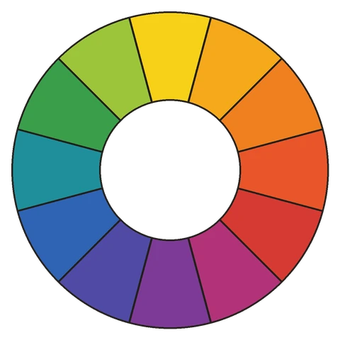
Almost everything said about combining colors comes from a wheel. In 1704, in his book Opticks, Isaac Newton published what is usually considered the first one: he arranged the colors of the rainbow in a circle, so that red and violet, the two ends, met. Newton was talking about light, but painters adopted the idea for their pigments.
The painter's wheel starts from three primary colors (red, yellow and blue), mixes them into secondaries (orange, green and violet), and places the in-between colors among them. With it at hand, combining colors is a matter of choosing by position.
Complementary: contrast
These sit opposite each other on the wheel: blue and orange, red and green, yellow and violet. Together, each makes the other look more vivid. They're great for making something stand out, as long as one leads and the other supports: a blue background with an orange center works better than half and half.
Analogous: calm
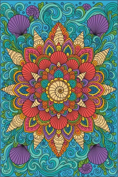
These are neighbors on the wheel: yellows, oranges and reds, or greens, turquoises and blues. Because they're alike, they feel calm and orderly, like a forest or the sea. To keep it from looking flat, play with lighter and darker shades of the same color.
Warm and cool
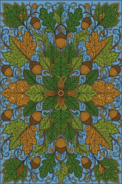
Reds, oranges and yellows are called warm; blues, greens and violets, cool. It's a classic painter's trick: warm colors seem to come forward and cool ones to recede. That's why a cool background with a warm subject gives depth, and a mostly cool picture with a warm touch draws the eye right to that spot.
The 60-30-10 rule
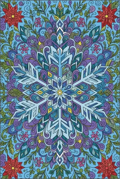
It comes from interior design and works just as well for coloring: a main color in roughly 60% of the picture, a secondary one in 30% and an accent in 10%. No need to measure: it's enough to have one clearly dominant color and one that appears only a little.
Light and shadow
An object doesn't have just one color: it's lighter where the light hits and darker in the shadow. If an apple has several areas, try a light red on the lit side and a darker one on the other. In Colorea, "More colors" opens a wheel to pick any shade, lighter or darker.
Palettes by theme
- Forest and garden: greens in several shades, browns and a flower accent (pink, yellow).
- Sea: blues and turquoises, sand and a touch of coral.
- Sunset: oranges, pinks and violets, from lightest to darkest.
- Winter: blues, grays and whites, with a red or gold for warmth.
When in doubt
Start with few colors, three to five. Try them on a small area before filling the big ones. And if you don't like it, undo. If you'd rather not decide at all, color by number already comes with the colors chosen: see how to color by number.
Keep reading
Try coloring
Free, no account needed.
Sources
- The Royal Society, "The colour wheel" (2021).